Insight
Overview
The Beautiful Places of Hong Kong became my project during my school term. We were tasked with crafting a 10-page magazine, and we had the freedom to select any topic. Drawing inspiration from my hometown, Hong Kong, I decided to create a tourist guidebook. Being a native of the city, I was eager to showcase hidden gems and lesser-known spots. To bring this vision to life, I extensively researched and curated a list of five must-visit places in Hong Kong.
The heart of my project lies in the meticulous design of each page. I incorporated captivating illustrations to enhance the layout, ensuring an engaging and visually appealing presentation. The aim was to not only inform but also to spark interest and curiosity in readers about these unique locations.
In the pages of this magazine, readers can expect a journey through the vibrant and diverse landscapes of Hong Kong, discovering places that might have eluded their awareness. This project is not just a compilation of information; it's a personal exploration and celebration of the beauty that my hometown has to offer. I'm excited to share these hidden treasures with others, creating an immersive experience through both words and visuals.
Design Concept
On each page, I meticulously designed distinct elements tailored to complement the essence of the featured place. For instance, in the introduction to 'Choi Hung Estate,' where 'Choi Hung' translates to 'rainbow' in Cantonese, I incorporated a vibrant rainbow design. This intentional choice not only adds a visually captivating element but also captures the cultural significance of the location, infusing the layout with a deeper connection to its name and meaning.
Description of each page
Cover
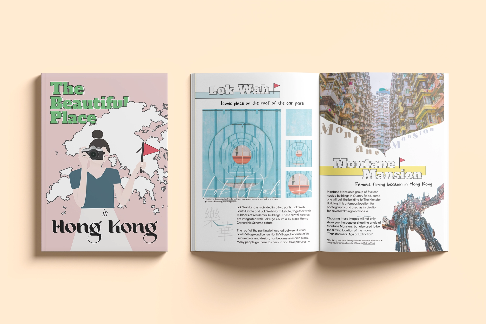
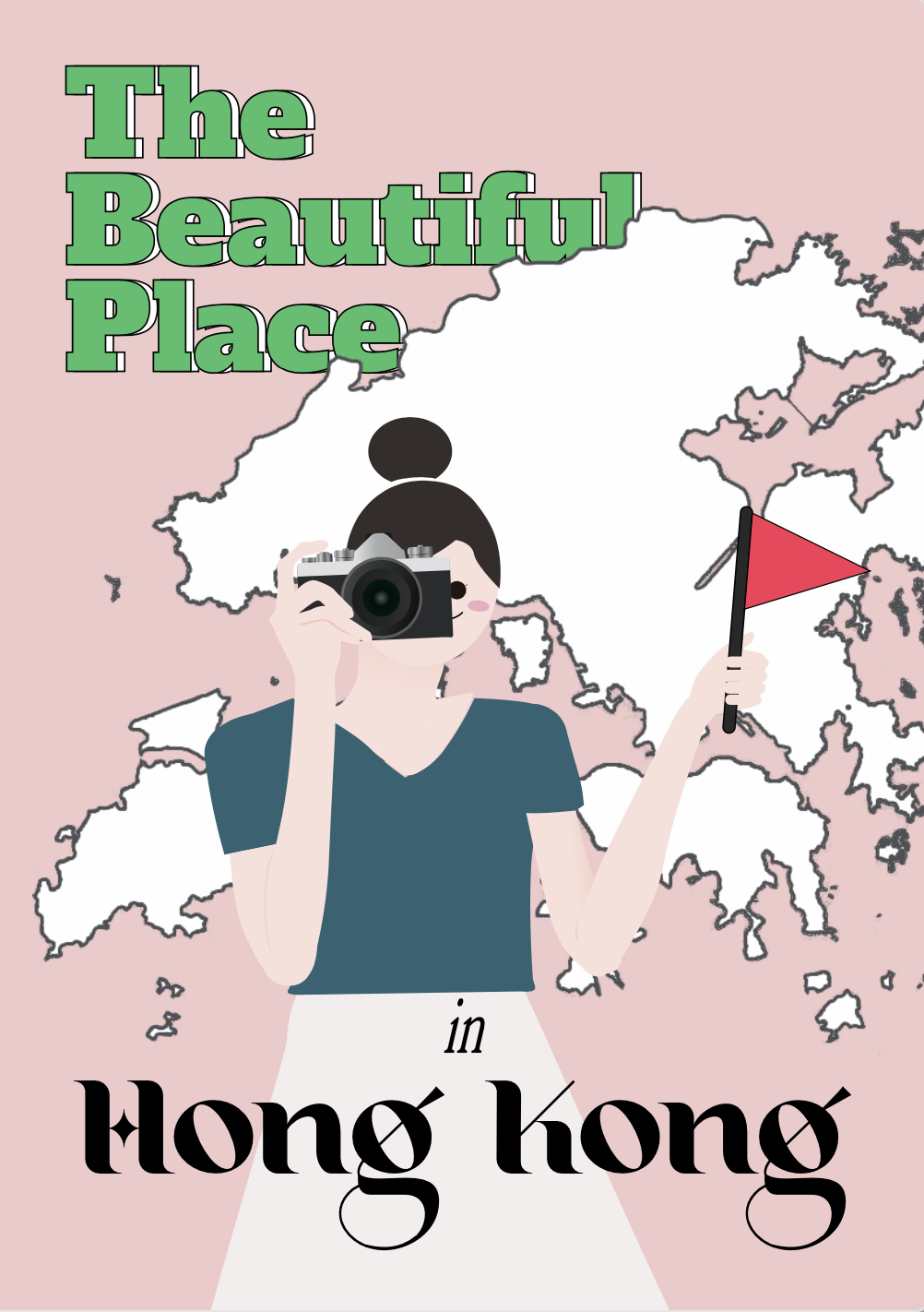
For the cover page, I created an illustration resembling a tourist, guiding you through the sights of Hong Kong. Behind the illustration, I incorporated the Hong Kong map to help readers orient themselves geographically.
Concerning typography, I employed three distinct font families. The title font is fixed throughout the magazine for consistency. However, the phrase "in Hong Kong" is designed to complement my perception of the city. I consider Hong Kong to be a sophisticated and diverse city where one can find everything they desire. To convey this, I selected a font family that incorporates stars, reflecting the city's allure and abundance.
Page 1-2: Choi Hung Estate
On pages 1-2, I aim to introduce the stunning "Choi Hung Estate" in Hong Kong, renowned for its vibrant and colorful aesthetic. The term "Choi Hung" translates to "Rainbow" in Cantonese, capturing the essence of the residence. To enhance the visual appeal of the outsourced photographs, I meticulously adjusted the color tones, intensifying the saturation to create a more vivid and rainbow-like effect. This effort was made to ensure that the photos truly embody the vibrancy and diversity associated with a rainbow.
CAdditionally, to reinforce the thematic coherence of the page, I designed a bespoke rainbow illustration for the title background. This visual element serves to seamlessly align the overall aesthetic of the page with the vibrant and colorful theme inspired by the Choi Hung Estate.
.projects-tags ul li:active a, .projects-tags ul li a:active { color: var(--color-text-second); font-weight: 600; }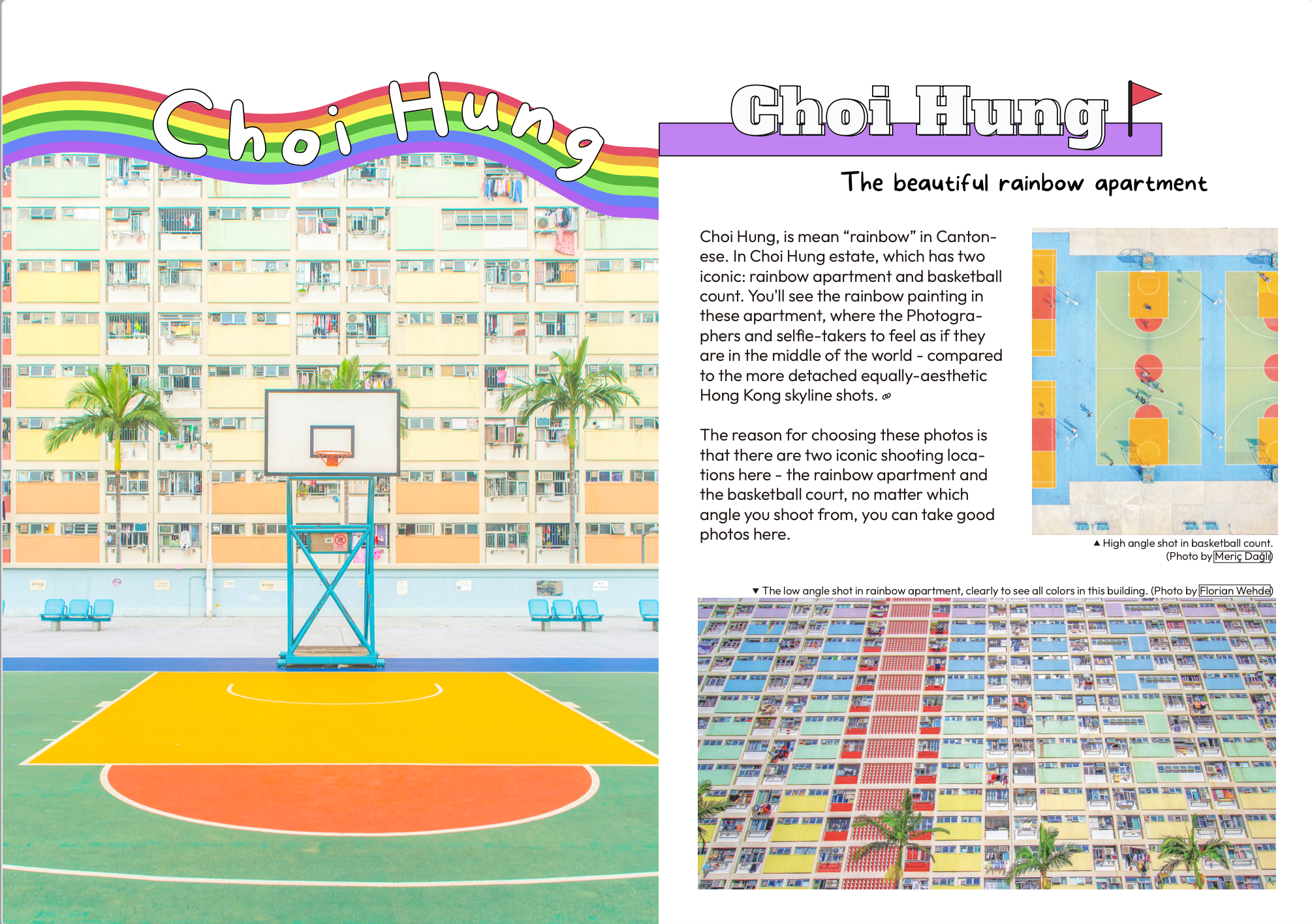
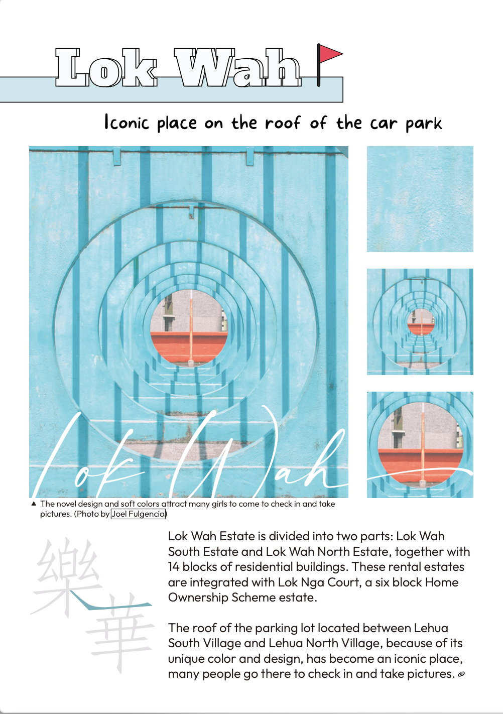
Page 3: Lok Wah Estate
For the cover page, I created an illustration resembling a tourist, guiding you through the sights of Hong Kong. Behind the illustration, I incorporated the Hong Kong map to help readers orient themselves geographically.
Concerning typography, I employed three distinct font families. The title font is fixed throughout the magazine for consistency. However, the phrase "in Hong Kong" is designed to complement my perception of the city. I consider Hong Kong to be a sophisticated and diverse city where one can find everything they desire. To convey this, I selected a font family that incorporates stars, reflecting the city's allure and abundance.
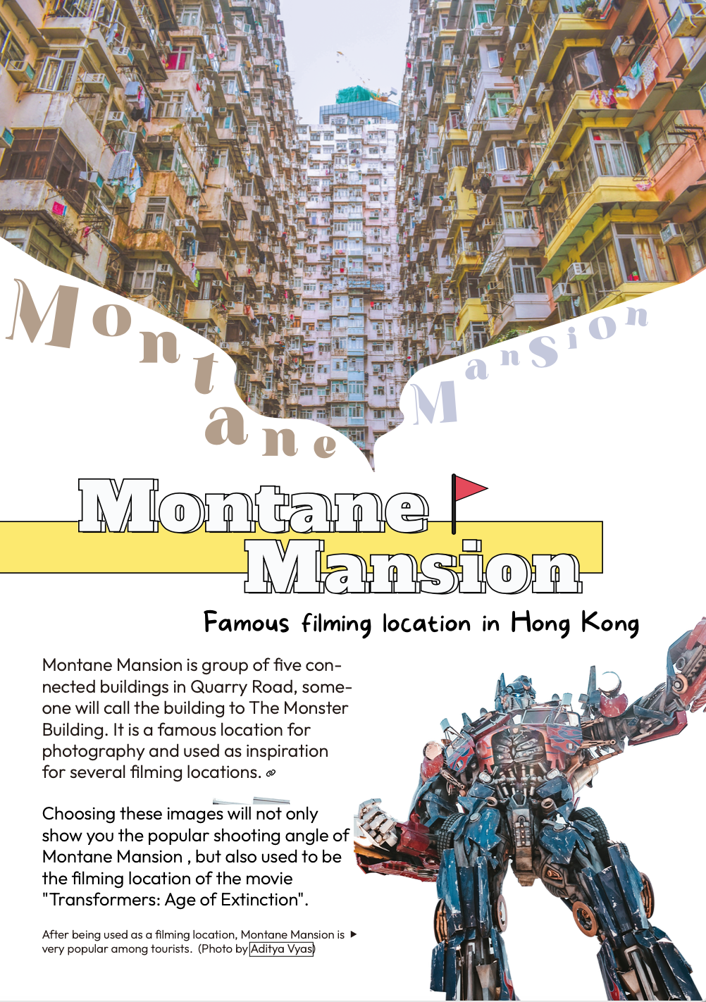
Page 4: Montane Mansion
For the cover page, I created an illustration resembling a tourist, guiding you through the sights of Hong Kong. Behind the illustration, I incorporated the Hong Kong map to help readers orient themselves geographically.
Concerning typography, I employed three distinct font families. The title font is fixed throughout the magazine for consistency. However, the phrase "in Hong Kong" is designed to complement my perception of the city. I consider Hong Kong to be a sophisticated and diverse city where one can find everything they desire. To convey this, I selected a font family that incorporates stars, reflecting the city's allure and abundance.
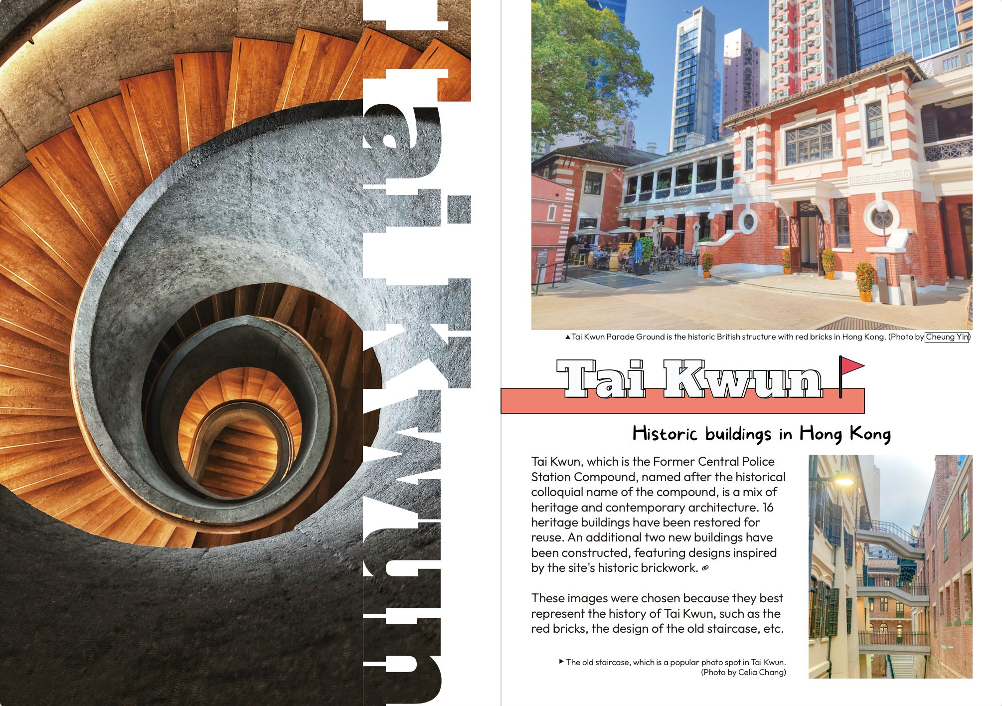
Page 5-6: Tai Kwun
For the cover page, I created an illustration resembling a tourist, guiding you through the sights of Hong Kong. Behind the illustration, I incorporated the Hong Kong map to help readers orient themselves geographically.
Concerning typography, I employed three distinct font families. The title font is fixed throughout the magazine for consistency. However, the phrase "in Hong Kong" is designed to complement my perception of the city. I consider Hong Kong to be a sophisticated and diverse city where one can find everything they desire. To convey this, I selected a font family that incorporates stars, reflecting the city's allure and abundance.
Page 7-8: Cheung Chau
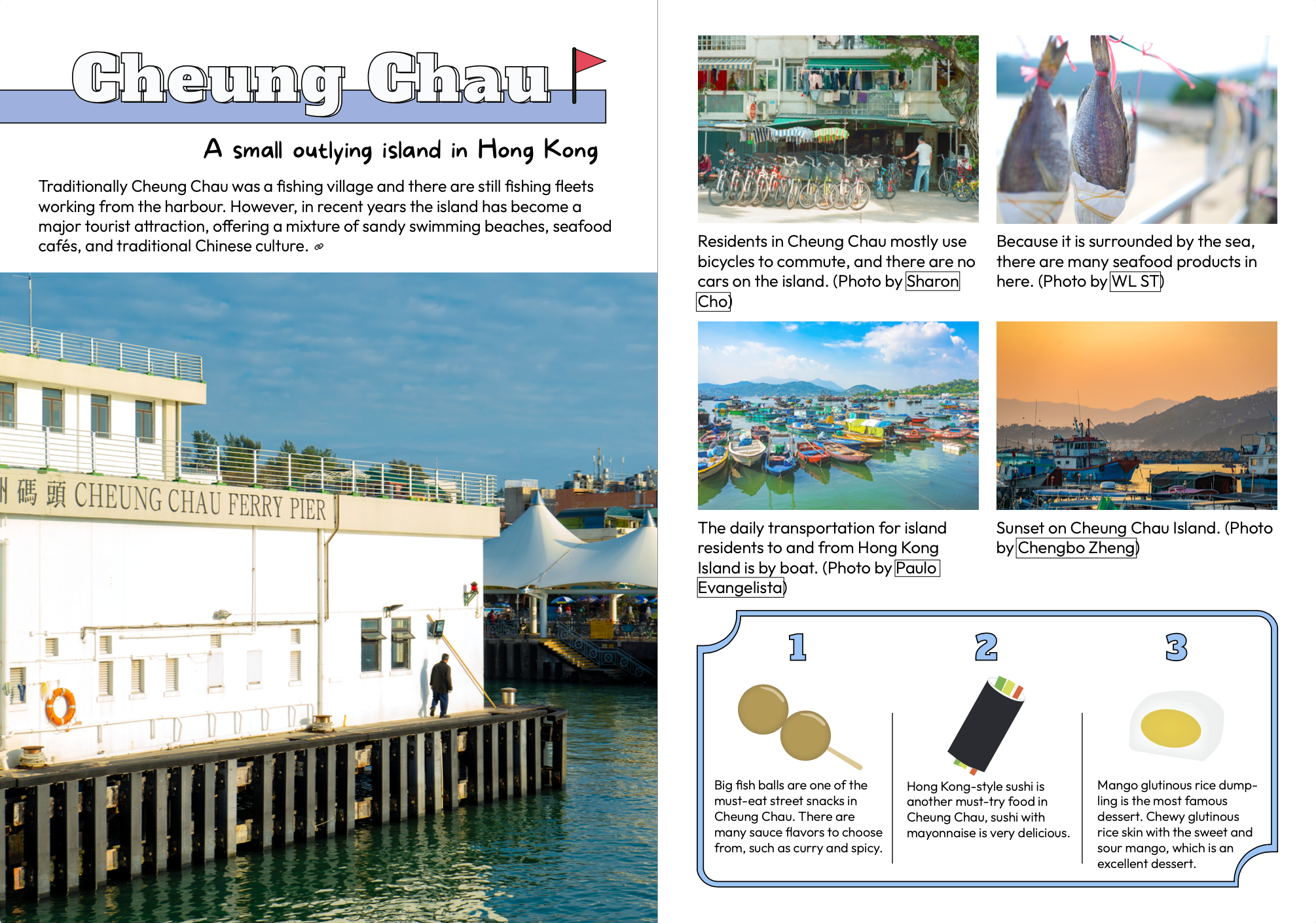
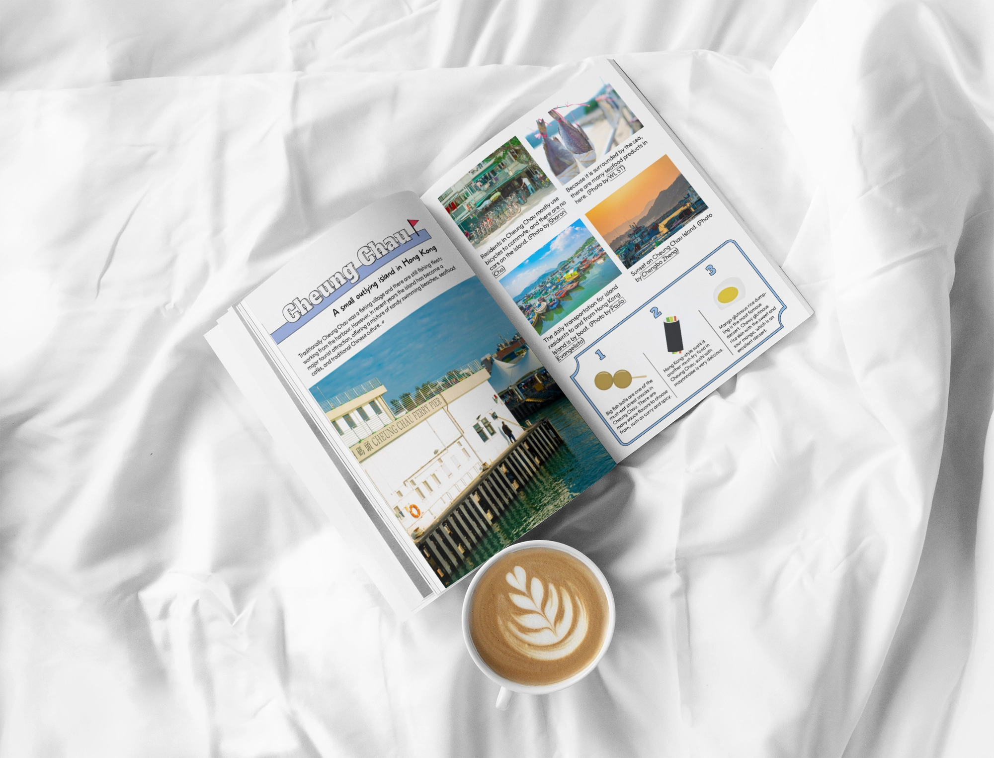
For the cover page, I created an illustration resembling a tourist, guiding you through the sights of Hong Kong. Behind the illustration, I incorporated the Hong Kong map to help readers orient themselves geographically.
Concerning typography, I employed three distinct font families. The title font is fixed throughout the magazine for consistency. However, the phrase "in Hong Kong" is designed to complement my perception of the city. I consider Hong Kong to be a sophisticated and diverse city where one can find everything they desire. To convey this, I selected a font family that incorporates stars, reflecting the city's allure and abundance.
